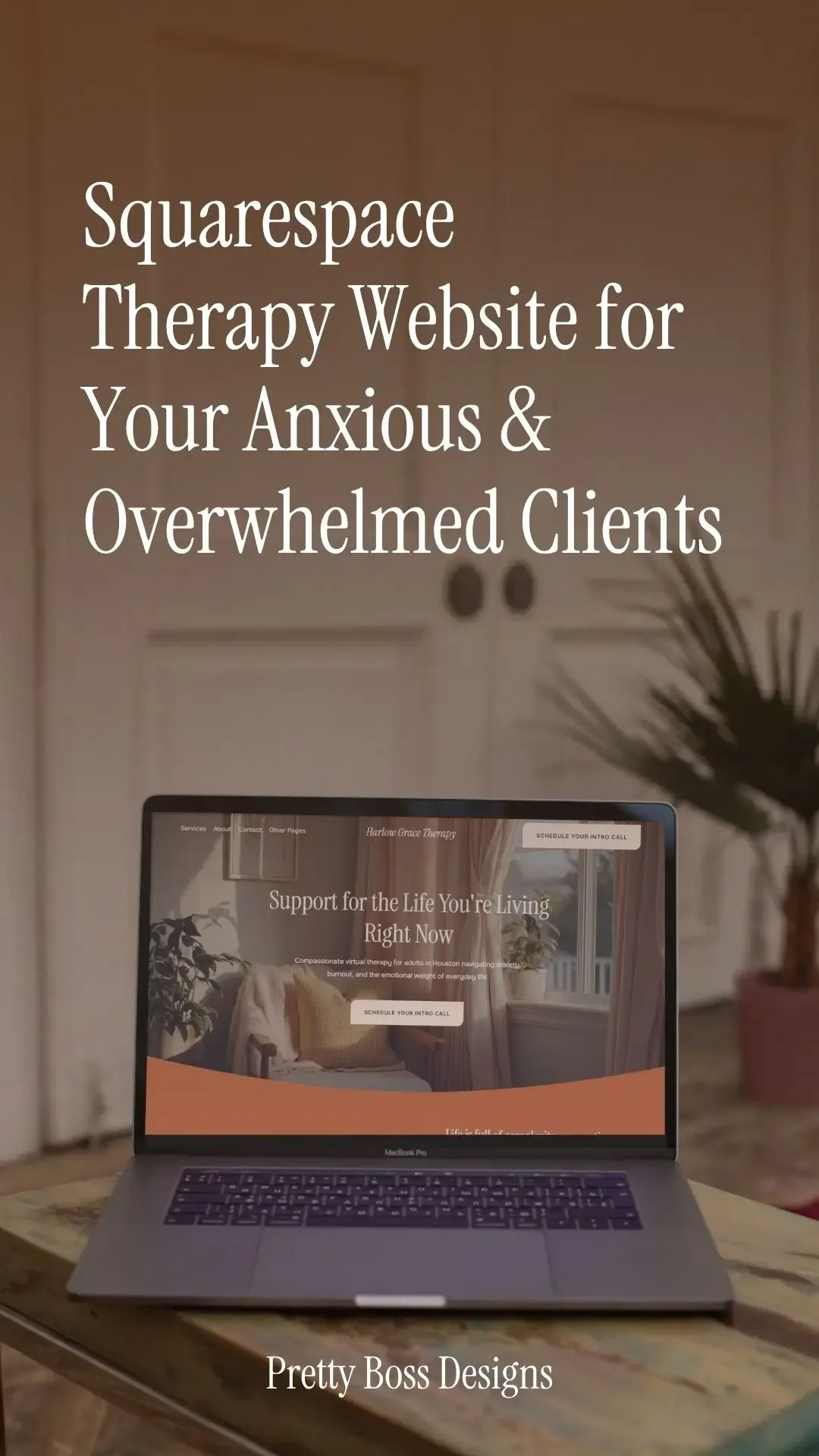
Designing a Squarespace Therapy Website for Anxious 2 AM Browsers
Picture this.
It is 2 AM. Someone is in the dark, scrolling on their phone. They have been putting off this moment for a while. Tonight something shifted, and they finally searched for a therapist.
They land on your website.
In the next few seconds they will decide whether to keep reading or close the tab. Not necessarily based on your credentials. Based on how your website feels.
This post walks through what that visitor needs from pages of your site and how the Spera template was built around that moment. If you want to follow along, the demo has every page referenced here.
The Homepage
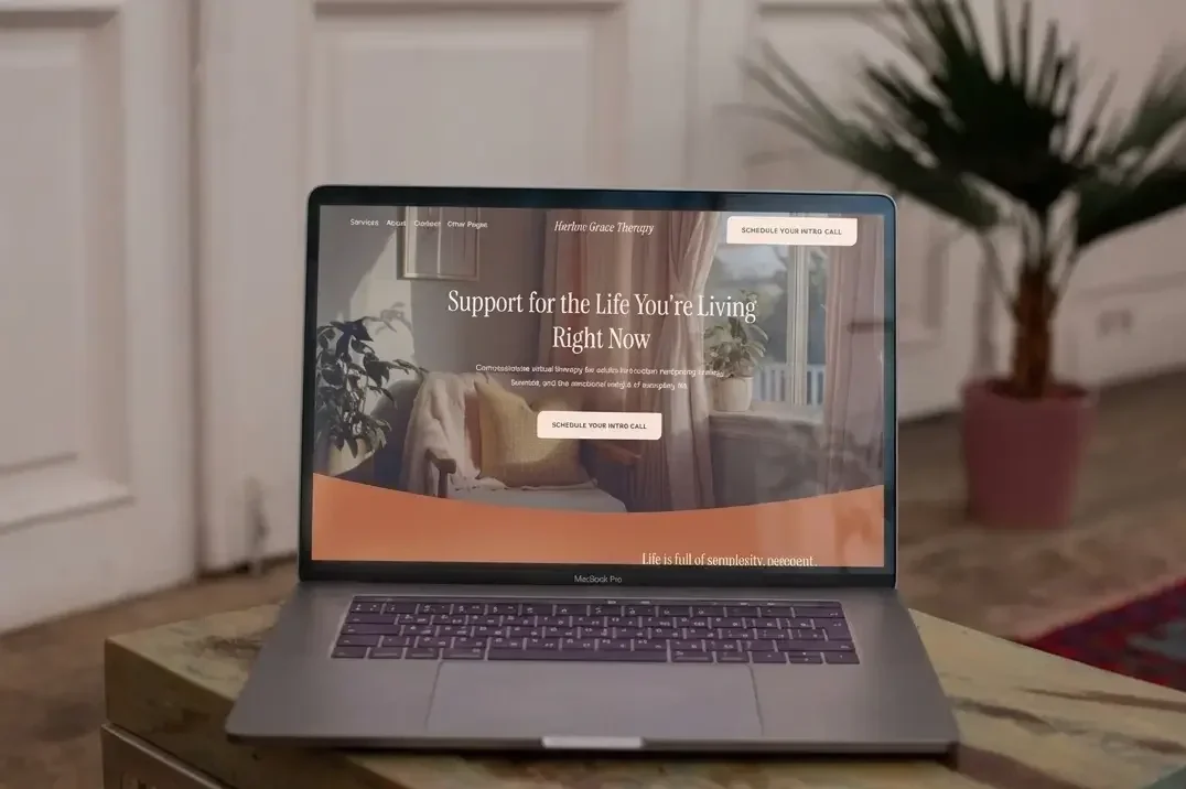
Your homepage is doing one thing: making someone feel settled enough to keep reading.
For a visitor who is already anxious and tired, a busy layout with a lot competing for attention can feel like too much. Spera uses a warm colour palette, generous spacing, and a hero headline written to meet visitors where they are rather than lead with credentials.
The page moves in one direction. Introduce the practice, build connection, show the services, explain how to get started, invite one clear next step. That next step, booking a free intro call, is woven through naturally rather than repeated loudly.
There is also a free resource section near the bottom. For the visitor who is not ready to book yet, it gives them something to take with them.
The Services Page
A visitor with decision fatigue does not want to sort through a long list of everything you offer. They want to find what applies to them and understand it quickly.
Spera gives each service its own section with a plain description and its own call to action. Payment and insurance information sits in its own block rather than buried in a paragraph. If you are an out of network or out of pocket provider, a short, honest explanation of what that means removes an ambiguity that a hesitant visitor might otherwise fill in with the worst assumption.
The three-step "How It Works" section also appears here, repeating what the homepage introduced. Seeing it twice reinforces that getting started is simpler than it might feel right now.
The About Page
The visitor reading your About page is still looking for themselves in what you have written.
Credentials matter, but what tends to move someone from reading to reaching out is feeling like you understand the kind of person they are. Spera structures the About page to move from your introduction and photo through your story and approach, and closes with a short beliefs section. A few plain, direct statements about what you believe about the people you work with can do more quiet reassurance work than a paragraph of qualifications.
The Booking Page
This is where someone's intention either becomes an appointment or quietly dissolves.
The fewer steps between "I want to book" and actually booking, the better. Spera builds the booking page around a single embedded scheduler block. Above it, three short steps orient the visitor so they know what they are walking into. Below it, a Good Faith Estimate note handles the legal disclosure (if required where you are located) without taking over the page.
There is also a crisis disclaimer built into the page. It tells visitors that the scheduler is not monitored for emergencies and links to the Get Help Now page. For someone who arrives in a harder moment than a typical booking visit, that note points them somewhere useful.
The Get Help Now Page
Not everyone who finds your website at 2 AM is ready to schedule a session. Some are in a moment that needs more immediate support.
Spera includes a dedicated crisis resources page with links to the 988 Suicide and Crisis Lifeline, the Crisis Text Line, emergency services, and international resources. It is linked in the footer and referenced from the booking page.
It is a small part of the template and a considered one.
The FAQ Page
There are questions that tend to sit between a visitor and their decision to reach out. Insurance. What the first session looks like. What to do if they are not sure therapy is right for them.
An accordion FAQ page lets visitors find what is relevant to them without reading through everything. Spera comes with a set of pre-written questions covering the topics that tend to come up early. You swap in with your own. The structure is already there.
The Blog
Not every visitor is ready to book when they find you. Some are still deciding whether they need support or what kind of support makes sense for them.
A blog gives those visitors a way to spend time with your voice before committing to a conversation. It also gives search engines something to index beyond your core pages. Spera includes a main blog page with a clean layout: image, title, and a short excerpt per post.
You do not need to post often. A few posts written honestly in your own voice is enough to give someone a feel for how you think.
The Social Links Page
If you post on Instagram, TikTok, or anywhere else, your link in bio is often the first stop for someone who wants to know more about you.
Spera includes a social links page built to work as that destination. Your photo, your practice name, and a clean stack of buttons linking to your most important pages. It lives on your own domain rather than a third-party tool, so someone tapping your bio link lands directly on your website.
It is also built for mobile in mind. Large buttons, a simple vertical layout, and your photo at the top so the visitor knows right away they are in the right place. Someone arriving from social media is almost always on their phone.
Putting It Together
Every page here is doing a version of the same thing: making it a little easier for someone who is already tired and hesitant to stay, read, and eventually reach out.
That is what a well-structured Squarespace therapy website does. Not impress. Reassure.
View the Spera demo here to see all of these pages in full.
Pretty Boss Designs creates Squarespace website templates for service-based business owners who want a polished starting point without the custom design price tag. Every template is built with care and intention so you can spend less time fussing with your website and more time doing the work you love.